


Reanalysis
Visualisation
“Seeing” large data sets
Reanalyses
Systems
generate
huge
amounts
of
data
that
cannot
be
absorbed
by
the
human
mind
without
further
refinement
and
interpretation.
One
tool
that
helps
to
make
the
data
more
accessible,
understandable
and
usable
is
data
“visualisation”.
Users
generate
a
query
describing
the
data
elements
they
want
displayed,
the
time
period
they
want
covered
and
the
visual
elements
they
want
used
(eg.
colour,
image
size,
etc.).
A
graphic
is
then
presented,
giving
the
user
a
clear
visual
representation
of
otherwise
complex
data.
The
graphic
can
be
a
still
image
or
an
animation,
for
instance:
“Data visualisation makes
complex data more
accessible,
understandable and
usable” (Wikipedia)
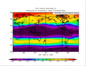

Tropopause 1000mb Zonal Wind
(m/s) composite mean
From 20CR Reanalysis system
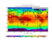
Air temperature (degK) composite
winds October 1899 to Oct 1900
The Weather of October 1918
(20CR system)
NASA has plotted GEOS5 aerosols:
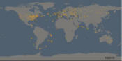
A time series visualisation of weather
observation data contained in the
International Surface Pressure
Databank
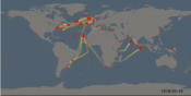
Movements of the 250 ships whose
logbooks were digitised by the
oldWeather project (1914-1923)
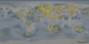
A visualisation of the impact that observations contributed by
ACRE partners had on the 20CR reconstruction of the weather of
1916. It shows:
•
earlier contributions made by ACRE partners and those
more recently made.
•
The “fog of ignorance” showing global regions where the
reconstructions are still very uncertain because there are
too few observations.
•
The “glow of discovery” showing regions where the new
observations have produced a large improvement in the
confidence of the reconstructions.
LINKS
20CR visualisations can be generated online
Further visualisations of ACRE assisted reanalyses

NCAR has plotted an East Asia coastal cyclone
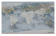
Visualisation show what
parts of the earth over time
are covered by the
observations contributed
by ACRE partners and
what parts are not
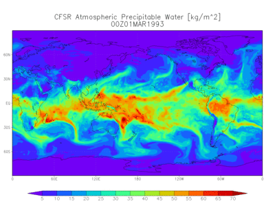
Geophysical models use
visualisations derived from
recent atmospheric data